How to Use Color in Art
Today we are going to explore color theory for artists and learn about some practical application. Color is one of the The 7 Elements of Art, and it’s extremely important to know how to use it correctly in your artwork.
In this art lesson we’ll break down the different components of color theory and explain how to apply to your work. This means looking at, and understanding, the types of color schemes artists use.
What is Color Theory
Simply put, it’s the visual impact of colors and the way they mix. This can be approached in a very elementary sense or it can become extremely complex.
For the purposes of this site, we will keep things fairly simple and straightforward as most of our lessons are designed for the beginner artist.
The Importance of Color Theory and Understanding How to Use Color in Art
As an artist, you need to understand the relationship between colors (color schemes) and how to apply that knowledge to a work of art.
Understanding color theory will give you that knowledge. And the good news is you really only need to learn a few basic concepts to have practical application.
If you need a more in-depth understanding, Wikipedia covers the topic pretty extensively.
The History of Color Theory
Throughout history there have been many contributors to the development of color theory. The earliest records are by Leone Battista Alberti in 1435. Leonardo da Vinci also wrote about color theory in his journals in the 1400’s.
During this time, color theory was mostly about the primary colors and how to mix them to make other colors.
If you are not familiar with da Vinci and his journals, they are nothing short of fascinating and I encourage you to learn more about them.
In 1704 Sir Isaac Newton expanded on this concept when he developed the first color wheel. He stated that when white light passes through a prism it created a spectrum of color.
Newton viewed this spectrum of color as being contained in a closed circle. Hence, the color wheel. These colors are red, orange, yellow, green, blue, indigo, and violet. Or, ROYGBIV.
In the 18th century, color theory evolved once again when Johann Wolfgang Goethe introduced the idea of emotion from colors. Using this concept of psychological effect, he developed a color wheel that included warm and cool colors.
From there, color theory was developed even further to include other characteristics of color as well. This brings us to the color theory systems we know today.
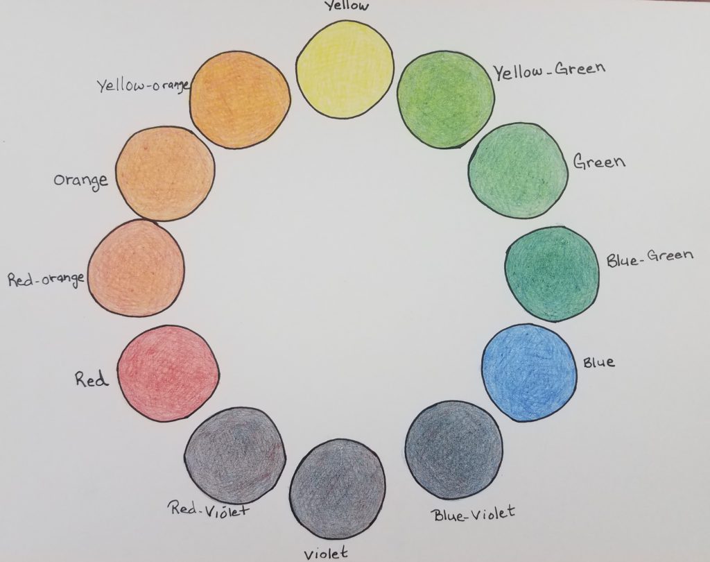
If the only thing you ever learn about color theory is the 12 hue color wheel, you’d be in pretty good shape. That is the easiest, and best way, to understand how to use color in art. So for that reason, let’s begin there.
The Color Wheel
When we talk about understanding color in art, the key component is the color wheel. The good news is, once the color wheel is explained to you it’s really pretty easy to understand.
There are many different types of color wheels. From very basic to pretty complex. Today we will be learning about the 12 hue color wheel.
If you refer back to the color characteristics, hue is the name of the color. So the color wheel we’ll be focusing on today has 12 different colors. You can learn how to make your own at, How to Make a Color Wheel for Beginners.
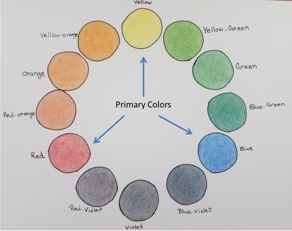
Primary Colors
The three most important colors are the primary colors. Which are yellow, red, and blue. These are the colors that can be used to make all the other colors. They can’t be made from other colors though.
Artists, such as Piet Mondrian, have created popular works using only primary colors in their art.
The primary colors are spaced evenly apart on the color wheel. On a 12 hue color wheel there are three spaces in between each of the primary colors.
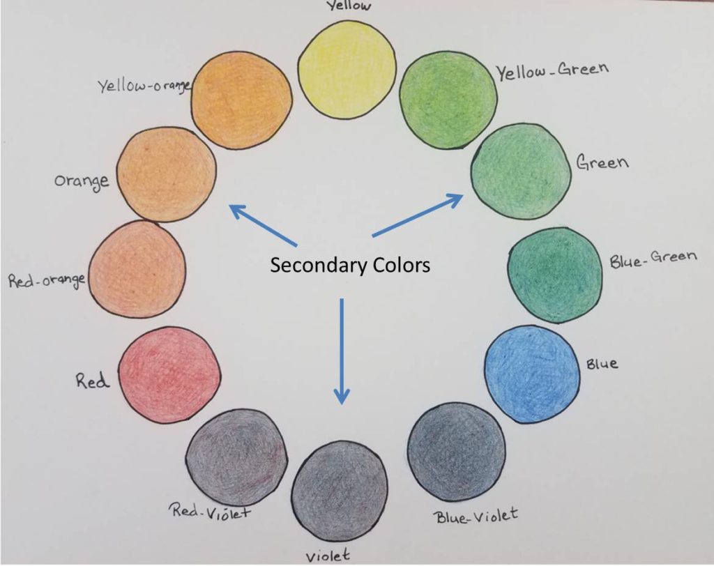
Secondary Colors
These are the three colors that are made from mixing two of the primary colors together.
They are,
Orange = yellow + red
Green = yellow + blue
Violet (purple) = red + blue
On the color wheel, these colors are placed directly between the two colors used to make them. So for example, orange is evenly spaced between yellow and red. The color is made by mixing even parts of the two primary colors of yellow and red. And of course the same concept goes for green and violet.
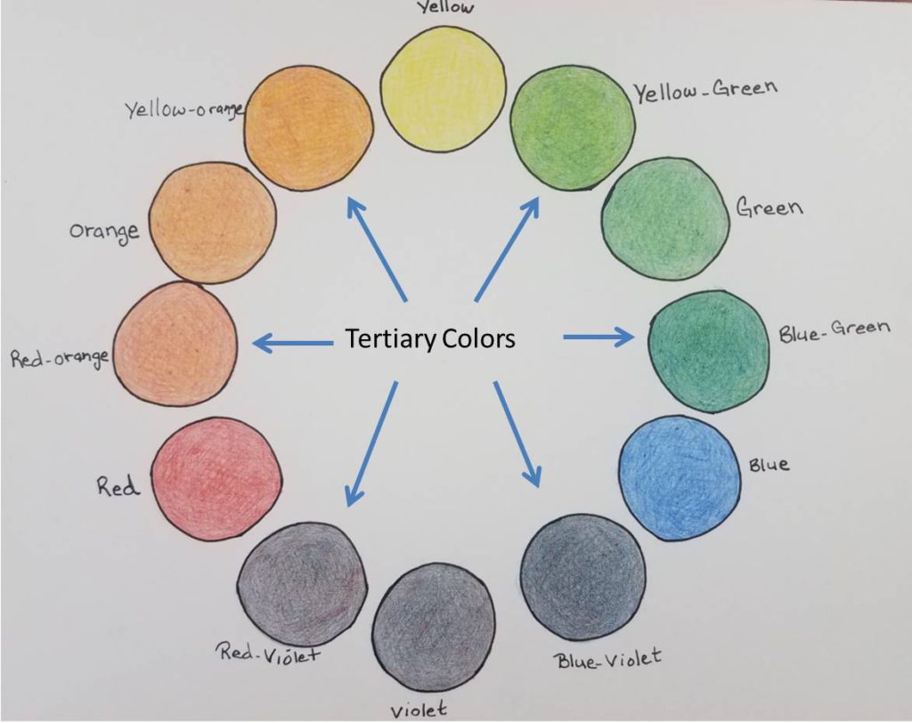
Tertiary Colors
The last set of color we will discuss for the color wheel are the tertiary colors. Which there are six of.
These colors are made by mixing a primary color with a secondary color. For example red-orange. It’s placement on the color wheel is right between red and orange.
The name of the tertiary colors always begins with the primary color, followed by the secondary color.
Characteristics of Color
Below are the characteristics of color, also known as color attributes. They’re an important part to understanding color theory and will each be covered more thoroughly later in this lesson.
Hue – the name of the color (red, orange, green, yellow, etc.)
Value – how light or dark a color is
Intensity – how bright or dull a color is
Temperature – warm or cool
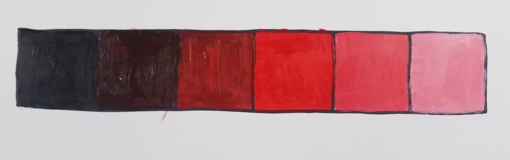
Color Value
Color value is how light or dark a hue is. Tints refers to the lightness of a color (hue) and are made by adding white. Shades are the darkness of a color and are made by adding black.
Intensity of Color
Intensity is the brightness of a color. Also, saturation and chroma can be used to describe the brightness of a color. Full intensity is the pure hue without mixing in an black or white. Adding gray to a color will make it more neutral, thus changing the Intensity of it.
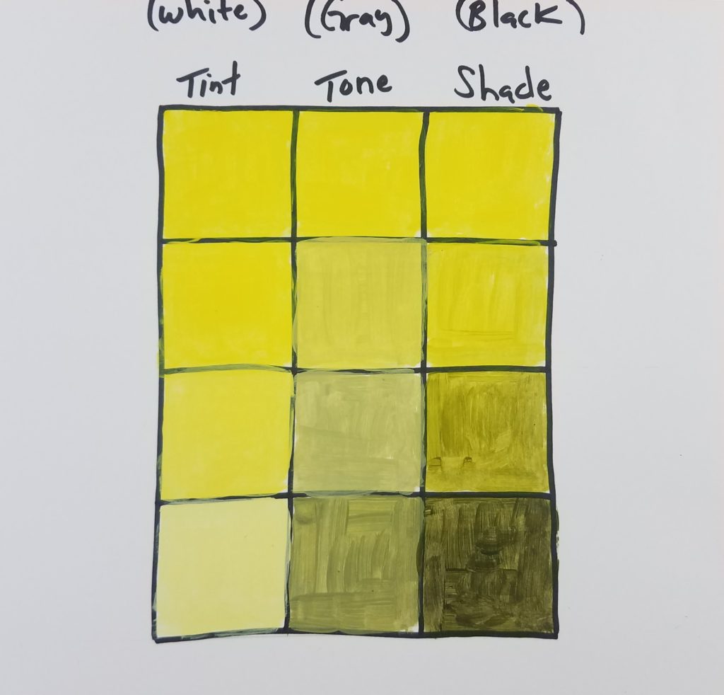
The intensity can also be changed by creating a tone when mixing a color’s complement with it.
Types of Color Schemes in Art
Complementary colors – colors that are opposite on the color wheel. They are,
- Red and green
- Yellow and violet (purple)
- Blue and orange
You can see examples of the complementary colors scheme anywhere you look. Christmas colors are red and green, for example.
Several sports teams use this color scheme as well. Detroit Tigers colors are blue and orange. Lakers are yellow and purple. And I’m sure there are many others out there as well.
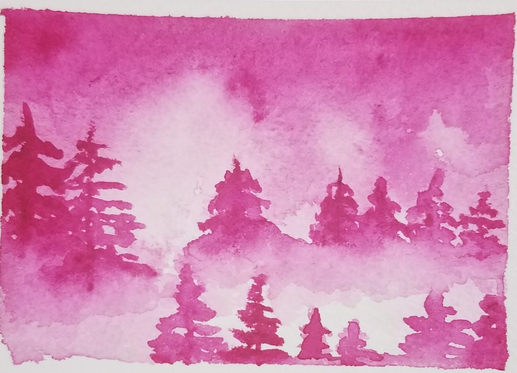
Monochromatic Color Scheme In Art
This color scheme refers to the use of only one hue. The hue can be varied by creating tints (adding white) and shades (adding black).
A color value scale is a perfect example of this. Which is created using one hue of paint, then adding black and white to alter that color.
Analogous Color Scheme in Art
This is a color scheme using only the colors that are adjacent (next) to each other on the color wheel. The colors value can be changed but they will remain very similar to each other.
There are several more color schemes, but these are the most common and are better suited for beginners.
Color Temperature
This refers to what are considered to be warm (red, yellow, orange) and cool (blue, green, violet) colors. Warm colors are called this because they remind us of the sun or fire. And cool colors because they remind us of water and ice.
Warm colors are intense, while cool colors are calming. This gives color the power to evoke emotion from the viewer.
Black, white, and gray are neutral colors.
Giving some thought to color temperature and what type of feelings you are trying to portray in your work is a good starting point in choosing your key color.
Color harmony
Color harmony is based on the color wheel and is used to create art that is aesthetically pleasing to the eye.
It’s created by choosing a key color for your artwork, and then building your design around that color using one of the types of color schemes.
So why should any of this matter to you as an artist? Because you want to create works of art that are pleasing to the eye. And you want your work to evoke the right type of feeling and emotion.
When choosing your color palette, it’s a good idea to limit yourself to maybe five or six colors. And use that set of colors to mix and blend different colors. This will help to keep your artwork more harmonious.
Using Color in Art | A Beginner’s Guide to Color Theory
Thanks for stopping by today and reading about understanding color theory for artists. Hopefully you have a better understanding of how to use colors in your art and are comfortable applying what you have learned.
Before you leave, grab your FREE Elements of Art Guide

I’ve always struggled with making my color palettes feel cohesive, so the breakdown of complementary vs. analogous schemes was exactly what I needed. It’s already changing how I approach my sketches. Lately, I’ve been using the Drawing Prompt Generator for inspiration, and this guide will help me choose colors for those ideas much more confidently.
I’m so glad you found the tutorial helpful.
This breakdown of complementary and analogous color schemes is exactly what I needed. I’ve been using the Drawing Prompt Generator for inspiration, but my pieces always felt flat. Now I can finally add some intentional, vibrant color to those ideas!
Thank you for letting me know it was helpful. Good luck with your art journey!
Thank you for this‼️❤️