
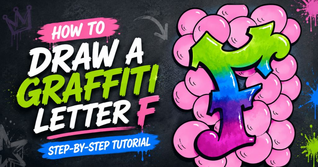
Getting Started with Graffiti Lettering
Drawing individual letters is a great way to practice your lettering skills. Today I’ll show you how to draw a graffiti letter F using simple shapes and guidelines.
This drawing tutorial is great for beginners who want to learn to make full graffiti drawings. You’ll learn to sketch, ink, and color your letter drawing using markers.
Let’s grab some supplies and get started.
* Some of the links in this post may be affiliate links. This means I receive small commissions for purchases made through these links at no extra cost to you.
Art Supplies
- Thin black marker
- Paper or cardstock
- Markers
- Pencil
- Click Eraser, Pink Pearl Eraser
- White Gelly Roll pen
Where to Look for Inspiration
Before you start drawing your graffiti letter F, it can help to spend a little time looking at different lettering styles. The goal isn’t to copy someone else’s design, but to notice what you like and gather ideas you can use in your own way.
Pinterest is a great place to start because you can quickly find lots of graffiti lettering, alphabet styles, bubble letters, block letters, and other creative typography. Try searching for things like graffiti letter F, graffiti alphabet, or graffiti lettering ideas.
Google Images is another useful option. You can search for different versions of the letter F and pay attention to how artists change the shape, thickness, angles, shadows, and details.
You can also find plenty of inspiration in real life. Look at murals, signs, stickers, album covers, T-shirts, skate graphics, packaging, and lettering you see around town. Even styles that aren’t technically graffiti can give you ideas for changing the shape of your letter.
Other places to look include:
- Street art and mural photography
- Graffiti and lettering books
- Instagram or other social media
- Comic books and graphic novels
- Logos and vintage advertisements
- Your own older drawings
As you look around, try to focus on individual elements you like. Maybe you like the curve from one letter, the shadow from another, or the way someone added an arrow or extension. Combining small ideas like these is a great way to experiment and develop a graffiti style that feels more like your own.
Practicing Before You Start Your Drawing
It can be extremely beneficial to do some quick rough sketches before you start working on your actual drawing.
To do this, simply find some reference photos of different styles of graffiti letters and quickly sketch out how the letter flow. Don’t spend a lot of time on this exercise. Three to Five minutes is plenty.
Keep everything loose and flowing. Don’t worry about all the little details. Focus on the flow of the letters and how the shapes breakdown and come together.
How to Draw a Graffiti Letter F
Regardless of what you’re drawing, starting with simple shapes and guidelines is always going to make things easier. So that’s how we’ll be starting our drawing today.
I’ll be doing my graffiti letter on an artist trading card that I cut myself out of a sheet of marker paper. But you can use any size and type of paper that you’d like.
Step 1: Draw a Basic F
Begin by deciding if you want to draw an uppercase or lowercase letter F. This is a personal preference and is entirely up to you.
Then draw your letter F using a single line, like you would if you were writing it as part of a word. Pay attention to how the lines curve, intersect, and flow.
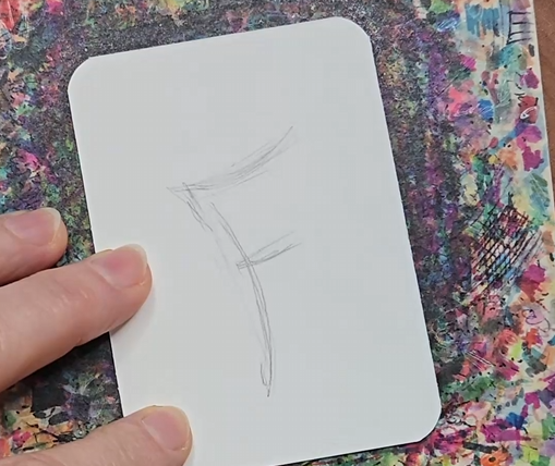
Make sure your sketch is the size you want it to be and is placed where you want it on your paper before moving onto the next step.
Step 2: Add Thickness to the Letter
When you are happy with how your letter F looks, begin adding the thickness to your letter. Use your guidelines from the previous step by adding lines on both sides of that line.
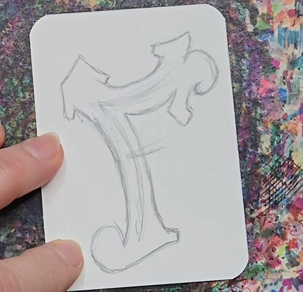
You can make your letter more interesting by making some areas thinner and others thicker. And by making your lines curve instead of drawing them straight.
Step 3: Shape and Style Your Graffiti Letter F
When drawing your letter, make sure you’re adding some style to it. This will make it look more interesting. Use the images you looked at earlier to get ideas of different ways to do this.
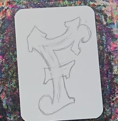
Anything extra that you add to your letter F that moves it away from a typical block letter style will help give that graffiti look.
Outline Your Letter with Black
After you have your letter all sketched out you can add a black outline. This is also called inking your drawing. When making your outline you should think about how thick you want it to be. You can make your lines all the same thickness or you can vary the line weight.
Outlining your drawing is easy. Just use a black pen or marker and trace over your pencil lines. Make sure you’re only going over the lines you want to keep. Any permanent pen will work for this.
You could also use a marker, which would give you a thicker outline. I prefer a pen to a marker for doing this because the pen will give you a crisper line. The markers tend to bleed into the paper more.
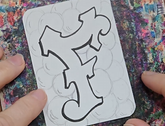
You could add a bit of a drop shadow to your drawing as well. This will add another level of detail to your drawing and make it look even more interesting.
If you need help with this, check out my tutorial on How to Add a Drop Shadow to Lettering.
After you are finished with your outline you can use a big eraser to clean everything up and remove the extra pencil lines.
Graffiti Letter F Drawing with Markers
Now it’s time to add some color to your drawing and really make it pop. I like using alcohol markers for my drawings. There are a lot of different brands with varying price tags. My favorite brand at the time of this post is Ohuhu. They are great markers and the price is very reasonable.
The first thing you need to do is decide on your color palette. I’m using a rainbow color scheme for my drawing but there are a ton of different combinations you could choose.
I started by adding the pink to the bottom of my letter, keeping in mind that I’m using four different markers so I want to cover roughly one fourth of the drawing. Then I used my purple marker for the next section, making sure I overlap the two colors a bit.
If you want to blend your colors together so there’s a smoother transition you need to use the first color to blend out the area where they overlap. So for this drawing I went back in with the pink and added more color with the purple stopped.
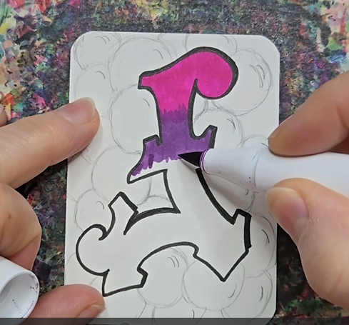
Then I repeated this process for the blue and green. The trick to getting a nice blend is that your markers need to be fairly close in color. So doing something like a rainbow of colors can be a bit tricky. To get a smoother blend you would need more markers with colors that are in between the two colors. Or, you can be happy with a slightly less smooth transition like what I ended up with here.
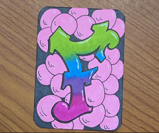
Finish up your drawing by adding in a nice background.
A white Gelly Roll pen can be used to add highlights.
Final Thoughts and Next Steps
Once you’ve finished your graffiti letter F, don’t feel like you have to stop with just one version. One of the best ways to get more comfortable with graffiti lettering is to draw the same letter again and make a few small changes each time.
Try changing the thickness of the letter, exaggerating the angles, adding different extensions, or experimenting with new colors and shadows. You can also use your finished letter F as inspiration for a completely different style.
The more versions you draw, the easier it becomes to see what you like and start developing your own way of creating graffiti letters.
If you enjoyed this tutorial, try another letter from the graffiti alphabet next, or practice combining a few letters together to create a short word. Most importantly, have fun experimenting and don’t worry about making every version perfect.
Get your FREE Graffiti Guide and learn the steps to creating your own graffiti art.