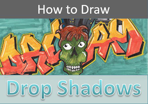
How to Draw Shadows on Lettering (Easy 3D Effect)
Learning how to add shadows to your lettering is easy and fun. You’ll learn step by step how to draw a drop shadow on your lettering art to create a nice 3D effect.
This will make your lettering art look really cool, and it’s super easy to do. Are you ready to take your letter art to the next level?
Let’s grab some supplies and get started.
Art Supplies
- Thin black marker
- Paper or cardstock
- Markers
- Pencil
- Click Eraser, Pink Pearl Eraser
- White Gelly Roll pen
Understanding Your Light Source
Before you can draw your drop shadows on your lettering, you need to have a basic understanding of your light source and how it works.
What is a light source? A light source is simply the direction from which your light is coming.
If you were drawing a landscape or an object that is outdoors, your light source would be the sun. If you’re indoors, your light source would come from a light or a window.
In either case your light source is what creates shadows and depth in your drawing.
Understanding Shadows
If you want to draw convincing 3D illustrations, you need to understand both light and shadow. They go hand in hand so it’s really just learning one concept.
When it comes to drawing shadows on letters or words, all you need to do is choose one direction from which your light source will be coming from. This will create shadows on the opposite side of your light source.
For example, if your light is coming from straight above your letters, your shadow would be created on the bottom. But that’s pretty boring.
You’ll typically want to have your shadows coming from more of an angle. If you’re light source is coming from the top left, your shadows will be on the bottom and to the right.
If this feels confusing or difficult there’s a simple trick you can use to help you make sense of it all.
Simple Trick to Understanding Shadows on Lettering
The most important thing to keep in mind when drawing your shadows on your lettering is that they can only be created on either the top or the bottom of a letter. And, they can only be on the left or the right sides of your letters.
You never want to draw your shadows on both sides, or both the top and bottom of your lettering.
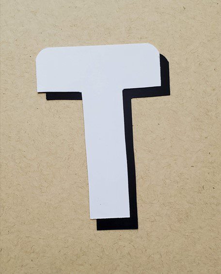
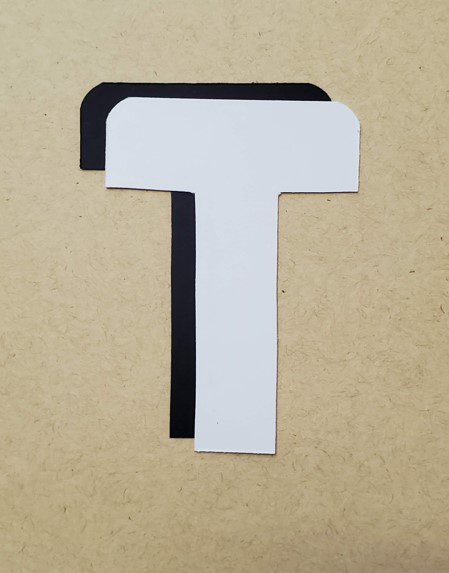
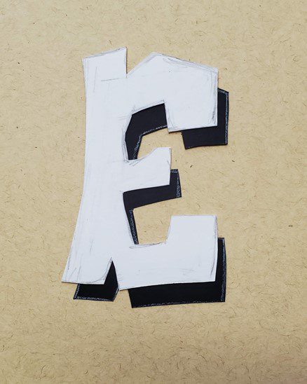
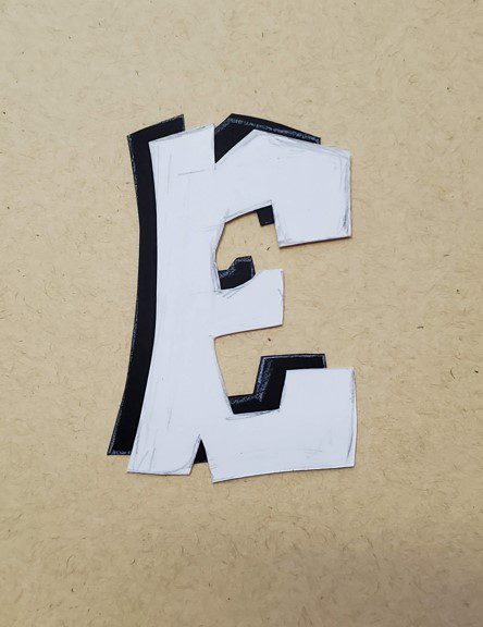
A simple trick to illustrate this is to cut out two identical letters. One from white paper, and one from black paper.
Then you can move the black letter to different positions to see where your drop shadows would be.
This will work for simple letters, like this block letter T.
Or, for more complex letters like this graffiti style letter E.
How to Draw Drop Shadows (on Letters) Step by Step
For most drawings you’ll probably be writing out words or phrases. But this is a fun exercise to practice with individual letters as well.
However, for the purpose of this tutorial we’ll be focusing on drawing one word with a drop shadow. But the concept is really the same with either one.
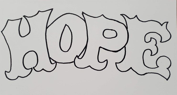
Step 1: Draw Your Letter or Word
Begin by drawing out your entire word. Do this however you would normally draw your letters.
If you would typically overlap your letters, then go ahead and draw them out that way. You don’t have to make any adjustments to accommodate adding a drop shadow.
If you want more help with learning how to draw your own style lettering, take a look at our art tutorial on drawing stylized lettering.
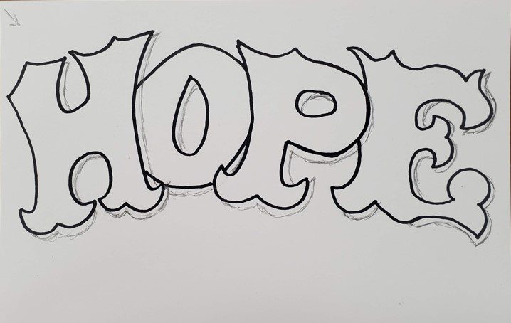
Step 2: Choose a Direction for Your Light Source
Decide which direction you want your light source to be coming from. Keep in mind your shadows will be placed opposite of this. It can be helpful to actually draw an arrow, sun, or lightbulb to indicate where the light is coming from. But this is optional.
Artists tend to have a preference to which direction they want their shadows to be placed.
You could have them in a different location from drawing to drawing. Or, you could simply make them the same for every drawing that you do.
However, you need to keep your shadows consistent within a drawing. This means you shouldn’t have one letter with the shadow on the top and left. Then have another letter with the shadow on the bottom and left.
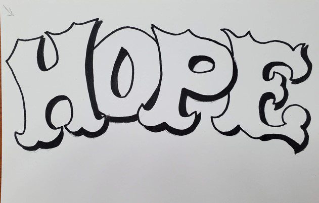
Step 3: Draw Your Shadows
Now that you’ve decided where your shadows are going to be placed on your lettering, it’s time to start drawing the drop shadows.
When you do this you want to keep the width of your shadows consistent throughout your drawing. Avoid making some wide and some thin. They don’t have to be perfect, but do try to keep them as even as possible.
You can vary the width from the right side to the top for example. But you should keep all of the right sides the same, as well as all the tops.
If your letters overlap, draw your shadows right on top of the letter that’s beneath your drop shadow.
After you have everything all drawn out, you can fill your shadow in with black or a different color, if you prefer.
Conclusion
As you can see, learning how to draw a drop shadow on your lettering is really pretty easy to do. Just follow the step by step instructions and you’ll be on your way.
If you want more information on learning to draw graffiti art, download our FREE guide.
Get your FREE Graffiti Guide and learn the steps to creating your own graffiti art.