Drawing Letters In Your Own Style
Ready to learn how to draw stylized letter? The techniques you’ll learn today, can be applied to any style of letters you want to draw.
This is something that will help you in your journey to drawing graffiti style lettering or just something with a bit more flare than your average lettering style.
Let’s begin by looking at the art supplies used for this art tutorial.
* Some of the links in this post may be affiliate links. This means I receive small commissions for purchases made through these links at no extra cost to you.
Art Supplies
Serif vs Sans Serif
Let’s begin by talking about the two basic types of typography. They are serif and sans serif. A serif is that extra stroke at the end of a main lettering stroke. It’s primary purpose is for decoration. Learn more about typography at Serif vs. Sans Serif.
When learning how to draw stylized letters, we will be working with both serif and San serif letters. You will need to decide which way you like better when doing your drawings.
Choosing a Word
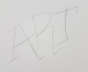
The first thing you need to do is decide on a word or a name that you want to draw. Whatever you decide to draw it should have some kind of meaning to you. Since we used ART in how to draw block letters, we’ll be using that word again today. What better way to do word art than the word ART, right?
How to Draw Letters – In Your Style
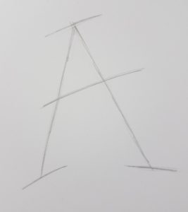
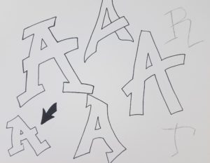
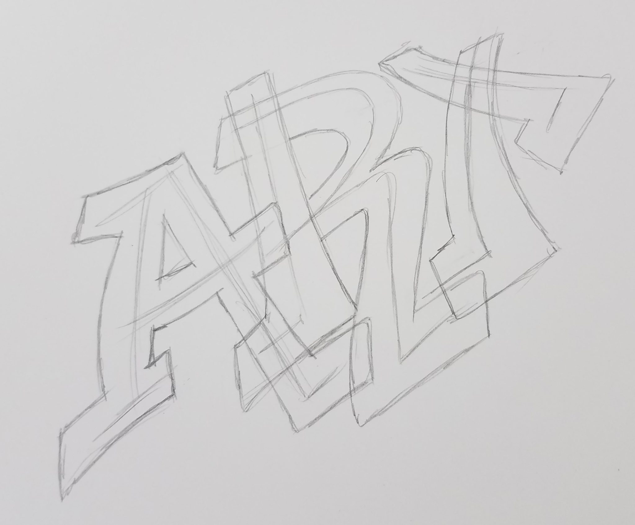
Let’s begin by doing some practice letters. I’m going to start by doing some drawings of the letter A. You can work on whichever letter you want first, it’s up to you. The purpose is to play around with the letters to make them look more interesting.
I’m using white cardstock for my drawing today. This paper works extremely well for markers.
Use the same technique as described in the How to Draw Block Letters lesson. Except this time, add a little style to your letters. A good way to do this is by adding serifs to the ends of your letter strokes. Another way to add some style is to curve your line.
And don’t draw your lines symmetrical. Making your letters uneven will add some style to them.
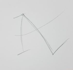
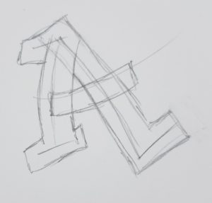
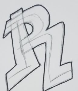
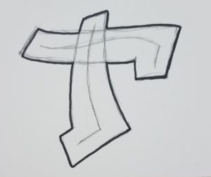
Adding Thickness to Your Stylized Letters
Again, follow the same technique we used in the block lettering lesson to add some thickness to your letters.
However this time, you should have several overlapping lines. We will clean these up later so no need to worry about it though.
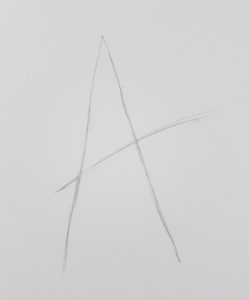
Keep Practicing Your Stylized Letters
Continue practicing your letter until you draw one you really like. The more variations you draw out, the better. As you continue drawing more, you’ll start to get more creative with your style.
This is what we want, and is the purpose of drawing the same letter several times. Challenge yourself to see how many different styles of the same letter you can come up with.
Drawing Letters
After you have drawn a style you like and want to use for your final work, draw the other letters for your word in that same style.
Use the same technique we’ve been using to do this. Don’t try taking shortcuts. Take your time and draw them out. If it takes a few tries to get it right, don’t worry about it. More practice is always going to benefit you.
Drawing Words with Style
Now it’s time to put it all together and draw out your final work of art, featuring the word you chose to draw.
As mentioned earlier, I’ll be using the word ART for this demonstration.
Draw out your word in the style you came up with from your practice drawing. Keep your letters close together. This will allow some parts of your letters to overlap.
Continue working on your letters using the same technique as when you were doing your practice drawings. Block out the areas around your guidelines to give your letters some thickness.
Varying the width of your letters will make them more interesting to look at. But be consistent with how you draw out each of the letters so they look like the same style when compared to each other.
Cleaning Up Your Lines
The way I approach cleaning up my lines is by going in and erasing all of the original letter guidelines first. After that, you have some decisions to make.
You need to decide which lines to keep, and which ones to get rid of. Will your letters overlap? And if they do, which ones do you want to be behind other letters?
We learned about this in How to Draw Graffiti Style Letters for Beginners. If you’re not sure what I’m talking about go back and review that lesson.
I drew my example a little different this time and had the letters connecting instead of having them overlap.
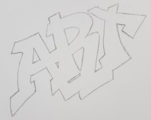
How you draw your letters will depend on your own artistic style. There really is no right or wrong here.
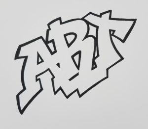
Inking Your Stylized Letters
After you are happy with how your drawing looks, it’s time to do the inking of your outline. I tend to like thick black lines for my lettering. But you may like something different. And that’s okay. You should always let your personal artistic style show in your work. I almost always use a Pitt Artist Pen for inking all of my work.
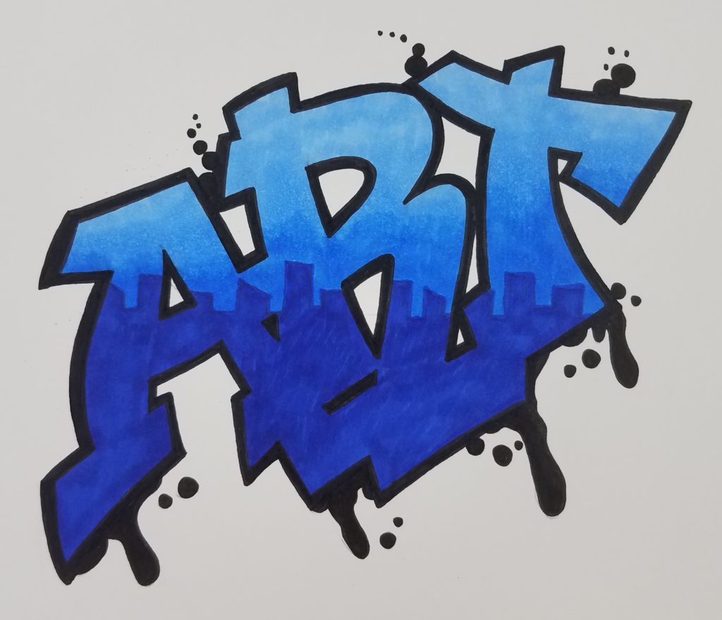
Coloring Stylized Letters
Now comes the really fun part. It’s time to liven your drawing up and really make it stand out. Before choosing your colors, you should decide on some kind of a color scheme.
For my drawing, I decided on blues for the letters and gray for the background.
You also need to decide on a medium to use for your drawing. I love using Bic Intensity markers for my work. They look great and are reasonably priced.
As you can see, I made a city skyline drawing across the bottom of my letters that I filled with the dark blue. And then blended in the tops with lighter shades of blue. The colors I used are Oceanview Blue, Blue Skies Blue, and Deep Sea Blue.
I also drew in some drips off the bottom edge of my lettering.
If you need help blending markers take a look at How to Blend Markers for Beginners.
Drawing a Background
The only thing left to do now is to draw some kind of a background for your stylized letters. Brick walls are pretty common for graffiti type sketches, so that’s what I did for this example. We have a tutorial on draw brick walls here, How to Draw Brick Walls.
I wanted the letters to stand out against my background, so I used gray Prismacolor pencils for the bricks because they are softer than markers.
To draw out the details of my bricks, I used Derwent Graphite Pens. I got this set of pens with the January Sketchbox shipment, and I’ve been looking for a project to use them on since then. They worked perfectly for drawing in the wall.
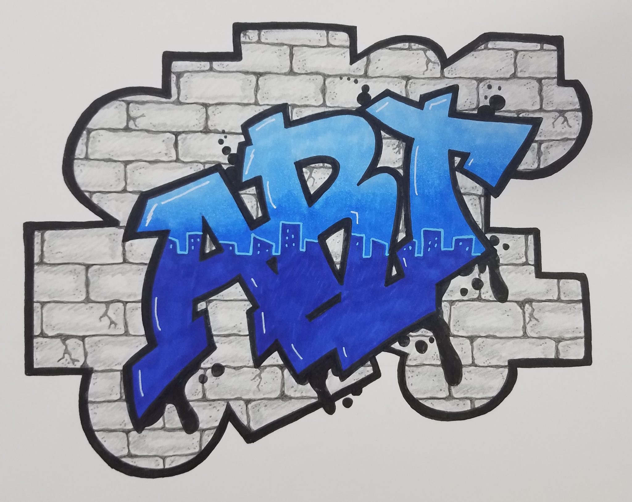
Posca pens were used to add white highlights to the letters and to outline the cityscape and windows. And that’s it, my stylized letter artwork is finished. The only thing left to do is add a signature and date.
How to Draw Stylized Letters
Thank you for stopping by today and learning how to draw letters in your own style. We hope you enjoyed this lesson. And don’t forget to stop back and share your artwork with us. We’d love to see it. See you soon.
Don’t forget to grab your Graffiti Freebie!