How to Paint a Value Scale
Lately we’ve been learning about color theory and how to use it in your artwork. Today we are going to learn how to paint a color value scale using acrylic paint.
These types of exercises can seem boring or tedious, I know. But, the benefits are enormous and they are definitely exercises that are worth doing. Color is one of the The 7 Elements of Art, so we need to make sure we understand how to use it in our works of art.
When we were learning about color theory, we talked about hue, value, and Intensity of color. Today I’d like to go a little more in depth with those ideas and actually mix some paints and do a little painting.
Let’s recap what those terms mean.
Value Scale Definitions
Hue – refers to the color of the paint (red, yellow, blue, green).
Value – refers to the lightness or darkness of a hue. We can tint a hue by adding white, and thus making it lighter. Or we can shade a hue by adding black to make it darker.
Intensity – also known as chroma, is the level of intensity of the hue. A color is at full Intensity when it’s a pure color, straight from the tube. A color’s intensity can be changed by adding gray to it.
In today’s art lesson we are going to change both the value and the intensity of a hue. Well, actually several hues.
So, if you’re ready to learn how to paint a color value scale, let’s start by taking a look at the art supplies you’ll need.
* Some of the links in this post may be affiliate links. This means I receive small commissions for purchases made through these links at no extra cost to you.
Art Supplies
Acrylic paint (red, yellow, blue, black, white)
Water
Paper towel
Color Value Scale Template
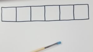
The first thing you need to do is draw out your grid for your value scale. I made a template out of cardstock, but you can also use a ruler or just draw it out freehand.
The overall size is about 8 inches long and about an inch wide. You can make yours bigger or smaller if you’d like. The size of your grid isn’t important.
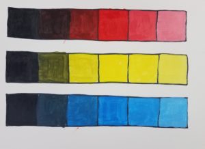
My grid has 6 boxes in it. Again, you could have more or less. The number of boxes in your value scale will determine how many different values you will need to mix up and paint.
I made my color value scale on cardstock. I drew it all out with a pencil, and then traced over the lines with a Sharpie marker.
Getting Set Up to Paint
Before you begin painting, you’ll want to get yourself all set up. Get a fresh container of water. You’ll need a clean paintbrush. And of course, your acrylic paint. Don’t forget to have a paper towel or something to wipe your brush on as well
Mixing Color Values
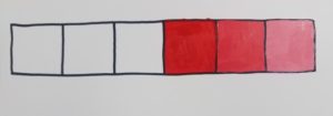
We will begin by painting a red color value scale using acrylic paint. If you made six boxes, fill the fourth box with pure red.
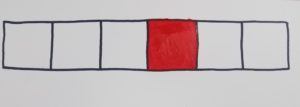
Try to fill your box in as evenly as possible. You want your paint to be smooth, and uniform. This exercise is also a good way to get familiar with your paint and how painting with it feels.
Next we are going to work on tinting the red. Start by mixing a little bit of white in with your red paint.
Since there are two boxes to the right of your pure red hue, you will need to make two different tints for your red.
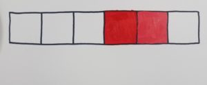
Mix your first tint with a little bit of white. And for your second tint, add a little more white.
If you drew out more boxes on your color value scale, continue the above process to make additional tints of red.
Making Color Shades (Red)
After you have filled up the boxes to the right of your pure red hue, begin working working on your shades of red.
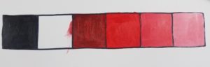
Be sure to clean out your brush really well. We don’t want white mixing in with the black. If the white does mix in with the black it will change the intensity of your color. We will be saving that exercise for the next painting.
Remember earlier we said black is added to a hue to create the shades for that color. Start by filling in the box to the far left of your color with pure black.
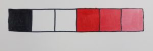
Next, mix a small amount of black in with your red and fill in the box directly to the left of your pure red.
For the final box, add a little more black to your red and fill it in.
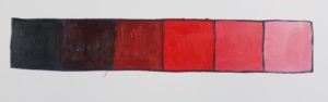
You should have a color value scale that gradually goes from pure black to a light red. If you have more boxes you can make your lightest value white. I didn’t have enough room so I used the white of my paper to represent my lightest value.
You probably don’t want to hear this, but you should do the same exercise for both yellow and blue. This color value scale exercise not only gives you a visual to see what the colors values will look like, but it also gives you some initial practice working with the paint.
Color Intensity
Now let’s talk about color intensity. Remember from earlier we said we can change a color’s intensity by mixing it with gray.
Again, begin by drawing out a grid for your color chart. You’ll need to draw out three boxes across and four boxes down.
To make it easier to keep track of what you are doing, add labels across the top. You can copy how I did mine.
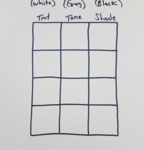
Mix your colors the same way you did for the color value scales. The only thing different, will be to add the extra boxes for your tones. Start with the pure color across all three boxes in the top row. Then, mix your colors according the chart by adding a little more of the different colors (white, gray, black) as you work your way down the chart.
Don’t forget to keep your brush really clean for the tints and shades.
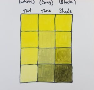
When you are done you’ll have a chart with tint, tone, and shade. It’s good practice to do this for all three colors as well.
If you’d like, you could do this last exercise instead of making the color value scale. I personally like seeing the values next to each other to see how they transition.
If you’ve completed both exercises with all three colors, you are a lot further ahead in your painting skills. Although it can seem a bit boring or tedious, these are extremely valuable exercises.
How to Paint a Color Value Scale
Learning the fundamentals of art may not seem exciting, but it’s a necessary task if you want to improve your artwork. Learning how to paint a color value scale will help you understand how to mix values. And the best way to learn how to do something is by doing it.
Master all of the elements of art and you’ll see overall improvements in your artwork.
Grab your FREE Elements of Art Guide
More Art Lessons Related to Color Value Scales